Table of Contents
Are you planning to give your home a fresh new look and wondering what the best colours for rooms are? The perfect colour palette can add warmth, energy, class and brightness to your space, transforming even the most tired looking house. But with so many options available, finding the right colours can be a little overwhelming. Don’t worry – we’ve put together these top tips to help you choose the perfect palette for every room in your home.
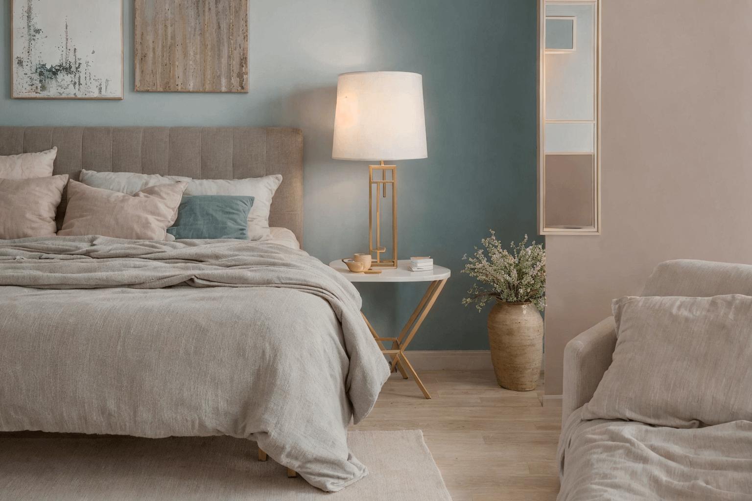
To begin with, it’s important to consider the function of each room. For example, in a bedroom, you might want colours that are soft and calming like pale blues or warm neutrals to promote rest and relaxation. In contrast, living rooms can benefit from richer, more inviting tones such as olive green, navy, or even bold accent colours that reflect your personality. Kitchens often do well with clean, bright hues like white, sage green, or soft yellow that evoke freshness and energy.
Another important consideration is the amount of natural light in the space. A room that faces north and receives limited sunlight may feel cold or gloomy if painted in a dark colour. In that case, opt for warmer, light-reflecting tones like cream, warm beige, or buttery yellows. On the other hand, a south-facing room with lots of sun can handle deeper, moodier colours like charcoal, forest green, or terracotta without feeling too dark or heavy.
When creating a cohesive look throughout the home, think about how each room connects to the next. A well-planned colour flow ensures that moving from one room to another feels natural and intentional. This doesn’t mean every room needs to be painted the same shade—but keeping to a unified palette or using accent colours that complement each other will help your home feel harmonious.
Don’t forget the undertones of the colours you choose. Two shades of gray may look similar on a paint chip, but one might have a cool blue undertone while the other leans warm and taupe. Always test your paints on a large patch of wall and observe them at different times of day under different lighting conditions.
Finally, add dimension and interest by incorporating different textures and finishes. A matte wall can be paired with glossy trim or metallic accents. Use colour blocking, painted ceilings, or an accent wall to bring extra character to a room without overwhelming it.
How can you choose the best colour for each room?
Start by thinking about the room’s purpose, the lighting conditions, and your own personal style. Use tester pots to experiment, and take note of how the colour changes throughout the day. Consider adjacent rooms for a smooth transition between spaces, and always balance the visual weight of darker tones with lighter elements to avoid making the space feel cramped. A carefully considered colour scheme can elevate your home’s design and make each room feel just right.
Consider the Light
The first thing you’ll want to consider when choosing the best colours for a room is how much natural light the room gets. Light and dark colours can have a big impact on the overall feel of a room, and the best colours for a room will be different if the room is north or south facing.
If the room is north facing, it will generally have less light, so you’ll want to stick with lighter colours. This will help open up the room and make it feel brighter and more spacious. Conversely, if the room is south facing, you can experiment with darker colours that will look vibrant in the sun.

What are the best colors to use in a north-facing room?
North-facing rooms tend to have cooler, less intense natural light, so it’s important to choose shades that can help warm up the space.
Soft neutrals like warm white, creamy beige, or light taupe can reflect the available light and make the space feel more inviting. If you’re looking for something with more personality, muted pastel tones—like blush pink, sage green, or soft lavender—can add charm without overwhelming the space.
In contrast, cooler colors like stark whites or icy blues can make a north-facing room feel colder and more shadowy. So when exploring room color ideas, it’s best to test a few interior paint colors directly on the wall and observe them at different times of day.
Considering natural light is one of the most practical and impactful home design tips when selecting your color palette. With the right tones, even a dimly lit room can feel open and cheerful.
Decide What Tone You Want
The next thing to consider when picking the best colours for rooms is what tone you want to go for. Warmer and more neutral tones, like beige and light grey, will create a calm and soothing atmosphere. Meanwhile, bold, jewel-toned colours will add an element of excitement and energy to any space.
You’ll also want to think about what colours you prefer. Simply sticking with the colours you know and love can help ensure that you end up with a room you adore. And if you’re working with particularly difficult or small spaces, it’s a good idea to steer clear of patterned walls or overly bright colours.
You’ll also want to think about what colours you prefer. Simply sticking with the colours you know and love can help ensure that you end up with a room you adore. And if you’re working with particularly difficult or small spaces, it’s a good idea to steer clear of patterned walls or overly bright colours. Interior design choices should reflect your personal taste while also adapting to the limitations of the space. Using a neutral color palette in smaller rooms can create a sense of openness, while bold accents can still be introduced through accessories like cushions, art, or lighting. This way, you maintain a cohesive color scheme without overwhelming the space.
What are the best paint colors for small or awkwardly shaped rooms?
The best paint colors for small or awkward rooms are usually soft and neutral tones, like off-whites, light grays, or warm beiges.
These colors help make a space feel more open and less cramped. Avoid overly dark or overly bright colors, as they can make the room feel even smaller or more chaotic. Instead, introduce depth through texture and layered decor elements.
Ask Yourself the Right Questions
When coordinating the best colours for a room, it’s important to think about how the room will be used. Do you want to create a peaceful area for relaxation or an invigorating space for creativity? Lighter, warmer colours are a great choice for a bedroom, while bold primary colours will add a fun and vibrant atmosphere to a playroom.

Equally important is considering what items you already have in the room and whether or not the colours will clash. Even the most striking colour won’t look good if it doesn’t go well with your furniture and other accessories – so make sure to take into account the colour of your rugs, curtains, and other items in the room. When planning your interior color palette, it’s essential to think holistically. Look at how each piece – from upholstery to decorative accents – contributes to the overall harmony of the space. If you’re unsure, try pulling colors from existing patterns in your textiles or artwork to build a cohesive look. This technique ensures your home decor feels intentional and visually pleasing.
How do I choose wall colors that match my existing decor?
To choose wall colors that match your existing decor, start by identifying dominant and accent shades already present in the room, like those in your furniture, area rugs, or curtains.
Use these as a guide when selecting complementary or neutral tones. You can also test swatches on the wall next to existing pieces to see how they interact in different lighting throughout the day.
Try Out Different Testers
Before making a final decision, it can be helpful to work with paint testers. You can easily get inexpensive testers from most paint stores and try out various colours before committing to a specific shade. You can also get paint cards and stick them on different walls in order to see how the colour looks in a variety of lighting.
Paying close attention to how the colour looks during the different times of the day can help ensure you choose the best colours for rooms. The colour may look bluer in bright natural light and slightly greener when it’s rainy or overcast. Taking the time to properly test the colour means you’ll be sure to avoid any surprises when it comes to paint time.
Incorporating color psychology into your decision-making can also be beneficial. Certain hues like soft blues or earthy greens can create a calming effect, while warm tones such as terracotta or mustard may make a room feel more inviting and vibrant. Don’t forget to factor in your room’s lighting design—natural and artificial light will both impact how the color reads. A well-planned interior color scheme will ensure the walls harmonize with your furnishings and décor for a seamless, stylish result.
Why is it important to test paint colors before choosing one?
Testing paint colors before choosing one allows you to see how the hue responds to different lighting conditions throughout the day. Paint can appear dramatically different under natural sunlight, evening lighting, or artificial bulbs. Trying samples on multiple walls ensures the paint finish and tone work harmoniously with your existing decor, avoiding unexpected results once the entire room is painted.
Conclusion
The best colours for a room can add warmth, energy, and style to any interior space. It’s important to take into account how much natural light the room gets, as well as the tone and the type of use you have planned for the space. Using testers to try out various colours is a great way to ensure you choose the perfect palette, and don’t forget to consider the colours of your existing decor. Whether you prefer dramatic jewel tones, calming neutral colours, or bold and bright colours, choosing the best colours for a room is an exciting and rewarding process when done right.
Keep exploring home and garden ideas: related articles:
10 Genius Pantry Organization Ideas to Keep Your Kitchen Clutter-Free
Ultimate Guide to Organization for Pantry: Tips and Tricks for a Clutter-Free Space
Top 9 Bathroom Décor Ideas for a Stylish and Functional Space
Dive into the World of Durian Furniture: A Guide to Stylish and Durable Pieces
Can You Use Garden Soil in Raised Beds with Vermiculite for a Raised Garden?
Frequently Asked Questions
What are the best colors to use in a north-facing room?
North-facing rooms tend to have cooler, less intense natural light, so it’s important to choose shades that can help warm up the space.